

By Adriane Quinlan
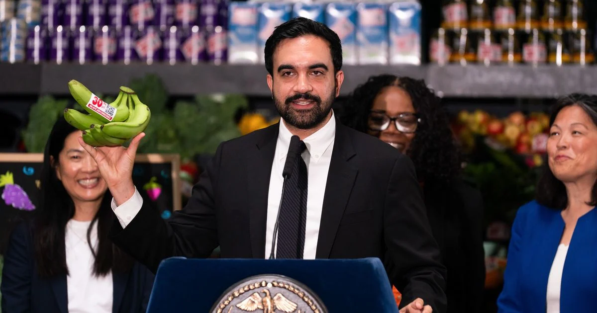
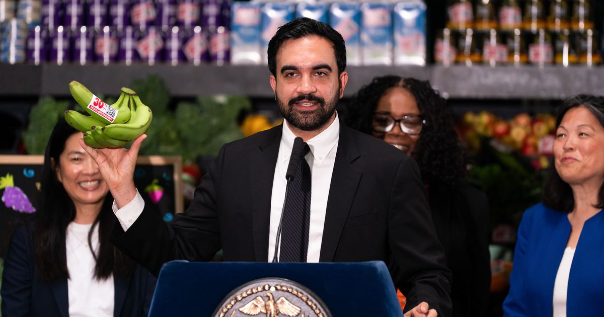
For decades, the concept of a government-subsidized grocery store in New York City conjured a very specific, utilitarian aesthetic: fluorescent-lit, gray-walled commissaries or the sterile, scuffed linoleum of a 1980s municipal office. These spaces were envisioned as purely functional—a means to an end in the fight against food deserts. But as Mayor Zohran Mamdani prepares to launch a pilot program for city-owned supermarkets, the visual identity of these locations is taking a sharp, unexpected turn.
The city has officially tapped a roster of creative agencies famous for defining the "millennial aesthetic"—the world of dopamine-inducing zigzags, retro-inspired typography, and playful, viral-ready branding. Far from the drab, institutional look one might expect from a municipal project, the new NYC Groceries are being designed by the same hands that brought us the cult-favorite Graza olive oil and the whimsical, wizard-laden boxes of Magic Spoon cereal.
The Architect of the "New" NYC Grocery
At the helm of this design strategy is Gander, a Brooklyn-based creative firm known for its high-impact, boutique-style visual identities. The New York City Economic Development Corporation (NYCEDC) selected Gander to spearhead the look, feel, and branding for the city’s first five supermarkets, with the inaugural location slated to open as early as next year.
The move is a deliberate pivot toward the modern retail experience. While the project’s primary mission is to lower the cost of living by cutting out middleman margins, the city has clearly decided that "affordable" does not have to mean "invisible." By hiring a firm with a pedigree in consumer-packaged-goods (CPG) branding, the administration is signaling that these stores are intended to be cultural hubs, not just distribution points for eggs and milk.
A Chronology of the Initiative
The road to the current design phase has been rapid, moving from a campaign promise to a concrete RFP (Request for Proposals) process:
- Campaign Phase: Mayor Mamdani’s candidacy was defined by a distinct visual language—hand-lettered graphics that evoked nostalgia and local pride. His administration’s success with the World Cup branding, which featured viral-ready, pigeon-themed jerseys, established a template for government-led design.
- The RFP Launch: In late 2025, the NYCEDC issued an RFP seeking a design partner capable of developing a brand identity that felt both quintessentially New York and uniquely accessible.
- The Selection: Last week, the city officially announced the winning team. While Gander is the lead, they are joined by a collaborative "super-team" of specialists: Noble Signs, Librarie, and Seven Roots.
- Next Steps: With sites currently being finalized, the firms are expected to move into the prototyping phase, determining everything from signage and color palettes to interior layout and checkout flow.
The Dream Team: Who is Building the Stores?
The EDC’s selection process reveals a strategic attempt to balance "vibes" with actual operational viability. By pairing branding experts with functional specialists, the city hopes to avoid the pitfalls of form over function.
Gander (The Creative Lead)
Known for their "deep expertise in the grocery space," Gander’s portfolio includes Pop Up Grocer, a brand that treats supermarket shelves like high-fashion boutiques. Their work often emphasizes clean, bold typography and vibrant color stories—elements that have made them a favorite for direct-to-consumer brands.
Noble Signs (The Urban Tacticians)
The shop behind the retro-inspired exteriors of Radio Bakery and the clever "Wash to Mash" sign-flip in Park Slope, Noble Signs will handle the physical street presence. Their role is crucial: they understand how to design for the chaotic visual landscape of New York City, ensuring the stores are visible and welcoming to local pedestrians.
Librarie (The Voice)
Naming a city-run grocery store is a linguistic minefield. "N.Y.C. Groceries" is a placeholder, but finding a name that resonates across diverse boroughs without sounding like a corporate chain or a government entity is a task for specialists. Librarie brings expertise in copywriting and crisis communications, which will be essential as the project navigates the inevitable political scrutiny.
Seven Roots (The Operational Backbone)
Based in Wisconsin, Seven Roots acts as the project’s grounding force. Their experience in building co-ops and independent grocers ensures that the store’s aesthetic doesn’t compromise efficiency. They are tasked with the "un-sexy" but vital work: aisle width, shelf height, and the logistics of restocking.
Supporting Data: The Retail-Design Paradox
The decision to invest heavily in branding for a low-cost food initiative has sparked debate among economists and urbanists. The core promise of the Mamdani plan is to lower prices by removing the layers of supply-chain profit. However, there is a legitimate fear that "shoppy-shop" branding—a term used by critics to describe the ultra-curated, high-cost aesthetic of independent grocers—could signal higher prices to the consumer.
If a store looks like a high-end boutique, shoppers may instinctively expect high-end prices. The city must now bridge the gap between accessible pricing and aspirational design. Critics point to Reddit threads where locals have expressed skepticism, noting that the city risks creating a "cringe" experience—a sanitized, "gentrified" version of a bodega that feels out of touch with the very residents it aims to serve.
Official Responses and Political Strategy
Mayor Mamdani’s office has defended the design-first approach as an essential component of city-building. "If we want these stores to be a success, they must be places people want to walk into," a spokesperson for the administration stated. The administration views the store’s visual identity as a way to reclaim public space, transforming the act of grocery shopping from a chore into a civic experience.
This aligns with Mamdani’s broader governance philosophy. He has consistently utilized graphic design to build political capital, from the keys to the city he redesigned to the viral World Cup branding. For Mamdani, design is not an accessory—it is a tool for communication and community engagement.
Implications: A New Era of Municipal Branding?
The implications of this project are twofold. First, if successful, it could set a new standard for municipal infrastructure. Cities often ignore the "look" of public services, assuming that because they are essential, they do not need to be engaging. Mamdani is betting that a well-designed store will foster more community trust and higher usage rates.
Second, the project is a test for the "Gander-fication" of the public sector. Can a firm that specializes in marketing $12 jars of small-batch olive oil to millennials successfully translate that skill to the sale of subsidized produce for a broad, diverse population?
The risk is clear: if the branding feels too "curated," it may alienate the working-class families the project is intended to support. If it feels too sterile, it will fail to capture the imagination of the city.
As we await the first storefronts, the tension remains: will the branding be a bridge to a more equitable food system, or will it be a layer of aesthetic polish that obscures the grit of the city’s most pressing economic challenges? For now, the city is betting that in New York, you have to look good to do good. Whether the public agrees will depend on the final price tag—both on the shelf and in the city’s budget.
