

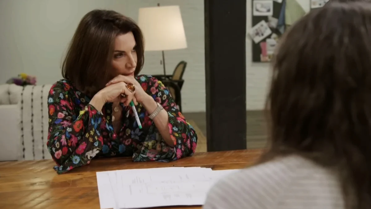
For decades, the classic white subway tile has reigned supreme in the world of kitchen design. Prized for its clinical cleanliness and perceived versatility, the white backsplash has become the default setting for homeowners and contractors alike. However, as interior design trends pivot toward personality-driven spaces, the dominance of "all-white-everything" is being challenged. Leading the charge is HGTV icon Hilary Farr, who, in a recent installment of her hit series Tough Love with Hilary Farr, demonstrated that moving away from the conventional can transform a sterile kitchen into a sophisticated focal point.
The Case Against the "Safe" White Backsplash
While the white backsplash is often marketed as a timeless, risk-averse choice, it carries inherent limitations that many homeowners only realize post-renovation. From a functional perspective, the high-gloss white surface—frequently chosen to reflect light—often acts as a beacon for every speck of grease, tomato sauce, or water spot. In a high-traffic environment like the kitchen, maintaining that "pristine" look is a daily battle.
Aesthetically, the reliance on white can result in a space that feels devoid of character. Without intentional layering of textures or materials, a white-on-white kitchen risks appearing cold and institutional. As designers move toward a "warm minimalism" aesthetic, the sterile nature of a traditional white tile can clash with the organic warmth that homeowners increasingly crave. Hilary Farr’s recent design intervention serves as a masterclass in breaking this monotony, proving that a single, bold choice can redefine the entire narrative of a room.
The "Tough Love" Transformation: A Chronology of the Shift
The transformation captured in Season 1, Episode 7 of Tough Love with Hilary Farr serves as a textbook example of how to inject soul into a minimalist kitchen.
The Initial Constraint
The project began with a familiar dilemma: a set of homeowners stuck in an "all-white" rut. With the decision already made to retain the existing white cabinetry, the space risked appearing flat and uninspired. In the early stages of the design process, the conventional path would have been to install a matching white tile to keep the palette uniform.
The Strategic Pivot
Recognizing the danger of a monochromatic void, Farr proposed a departure from the blueprint. In a candid moment during the episode, Farr remarked, "I really want to add a bold color to their kitchen somewhere, and that backsplash is the perfect place. Instead of the classic white tiles I planned, I’m now giving them blue glass tiles that will become a focal point in the kitchen."
The Execution
The decision to run the blue glass tiles vertically, all the way to the ceiling, was a bold architectural choice. This design move elevated the tile from a mere protective barrier behind the stove to a vertical feature wall. By framing the range hood, the tile tempered the industrial, cold aesthetic of the stainless steel, replacing it with a refined, jewel-toned depth. The project concluded with the tile acting as the room’s anchor, drawing the eye and providing the visual weight necessary to balance the airy, white-dominated space.
Supporting Data: The Psychology of Color and Texture
The success of Farr’s design is not merely a matter of taste; it is rooted in fundamental principles of interior design and color theory.
The Role of Depth
When a room is monochromatic, the human eye struggles to find a place to "rest," often leading to the perception that the room is either cluttered or lifeless. By introducing a high-gloss blue glass, Farr introduced chromatic depth. Glass tiles, unlike matte ceramic or stone, possess a unique refractive quality. They interact with natural and artificial light, creating a sense of movement that changes throughout the day.
Texture and Contrast
The juxtaposition of the sleek, glossy blue tiles against the organic, earthy texture of open wooden shelving is a deliberate design tactic. This contrast prevents the "sterile" look often associated with glass. By pairing the cool blue with the warmth of wood, Farr created a balanced environment that feels both modern and approachable.
The "Expensive" Factor
Interior design experts have long noted that high-impact installations—such as floor-to-ceiling tile—are among the most effective ways to increase the perceived value of a home. This installation signals a high level of craftsmanship and intentionality, shifting the kitchen from a utilitarian cooking space to a curated living area.
Balancing the Bold: Expert Insights on Implementation
While the blue glass backsplash is a powerful tool, it requires careful consideration before implementation. Designers emphasize that a "focal point" can only exist if there is a hierarchy of visual elements.
The Hierarchy of Elements
Before committing to a bold color, homeowners must evaluate their existing statement pieces. If a kitchen already features a heavily veined marble countertop or a dramatic, oversized light fixture, the addition of a high-gloss blue tile might create a "clash of the titans." The goal is to avoid sensory overload.
As Farr noted in the episode, "Since we lost the blue in the island cabinets, I made up for it with this lovely blue in the backsplash." This indicates a balancing act: if one area of the kitchen loses its color, the design must compensate elsewhere without overcompensating everywhere.
Assessing Temperature
It is critical to distinguish between color tones. The blue chosen by Farr is cool, which offers a calming, modern effect. However, for homeowners who desire a "cozy" or "cottage-core" kitchen, a cool blue might feel too detached. Designers recommend:
- Cool Hues (Blues/Greens): Best for modern, crisp, and airy spaces.
- Warm Hues (Terracotta/Amber/Warm Greys): Best for traditional, inviting, and intimate spaces.
Implications for Future Renovations
The shift away from safe, neutral backsplashes marks a broader trend in residential architecture toward "maximalist minimalism." Homeowners are increasingly willing to take risks with color, provided that the underlying structure of the kitchen remains functional.
The Cost of Luxury
One implication of the "Farr Method"—running tile to the ceiling—is the increased cost of labor and materials. While this is a significant upfront investment, it is an investment in the long-term desirability of the home. As the housing market emphasizes "move-in ready" luxury, the trend toward full-height backsplashes is likely to continue.
The Death of the "Safe" Choice?
The primary takeaway from the Tough Love transformation is that "safety" in design is often a masquerade for lack of vision. While the white backsplash will likely never disappear—it is, after all, a classic for a reason—its position as the default is waning. The modern homeowner is being encouraged to ask themselves: Does this design choice bring me joy, or am I just choosing it because it’s what everyone else is doing?
As Hilary Farr demonstrated, when you lean into a bold, deliberate color, you don’t just change the color of your walls; you change the entire atmosphere of your home. The blue glass tile serves as a reminder that the heart of the home should be allowed to have a heartbeat—and sometimes, that requires a little bit of color.
Conclusion: A New Standard for Kitchens
Whether you are remodeling a kitchen for resale or personal enjoyment, the move toward vibrant, textured backsplashes is a trend worth watching. By prioritizing depth, balancing tones, and committing to a central design vision, homeowners can achieve a space that is not only functional but deeply personal. As Hilary Farr has shown, the "focal point" is not just a design term—it is the soul of the kitchen, and it is time we stopped hiding it behind a veil of white.
